Transform your PDF into a modern e-paper
With Prenly, you get fully branded apps to distribute e-paper, podcasts, web news, interactive crosswords and other publications – all from a single platform.Get a free demo
of innovation & expertise
100%
of Sweden’s daily newspapers
2+ million
readers daily
23 minutes
average daily usage
This is Prenly
Prenly is driving the development of the next generation of digital newspapers, in close collaboration with industry publishers. The platform includes Prenly Workspace for creation and Prenly Reader for the reading experience.
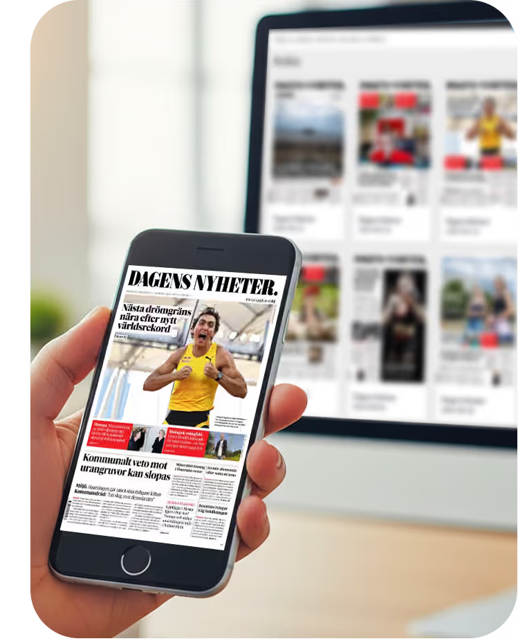
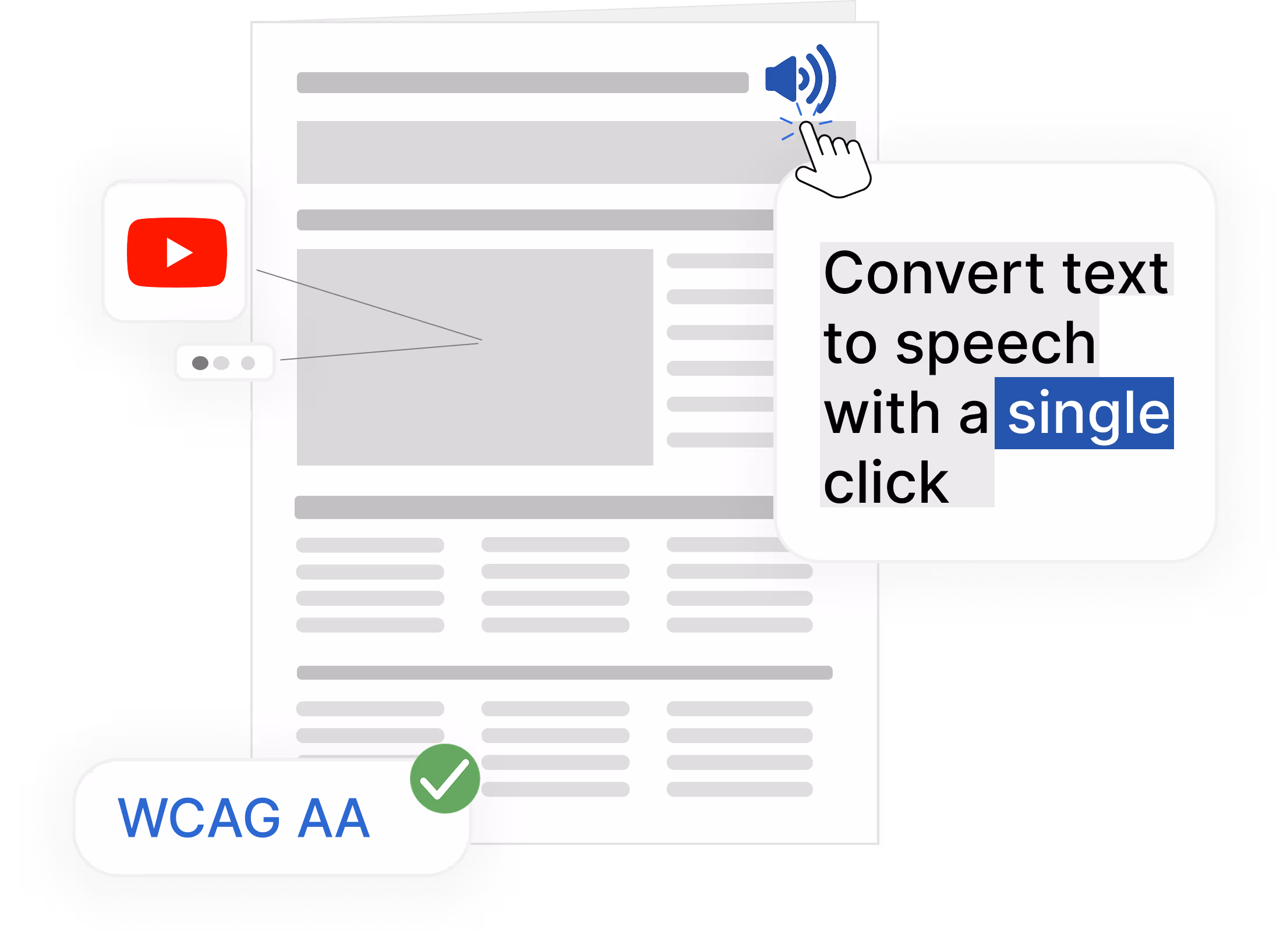
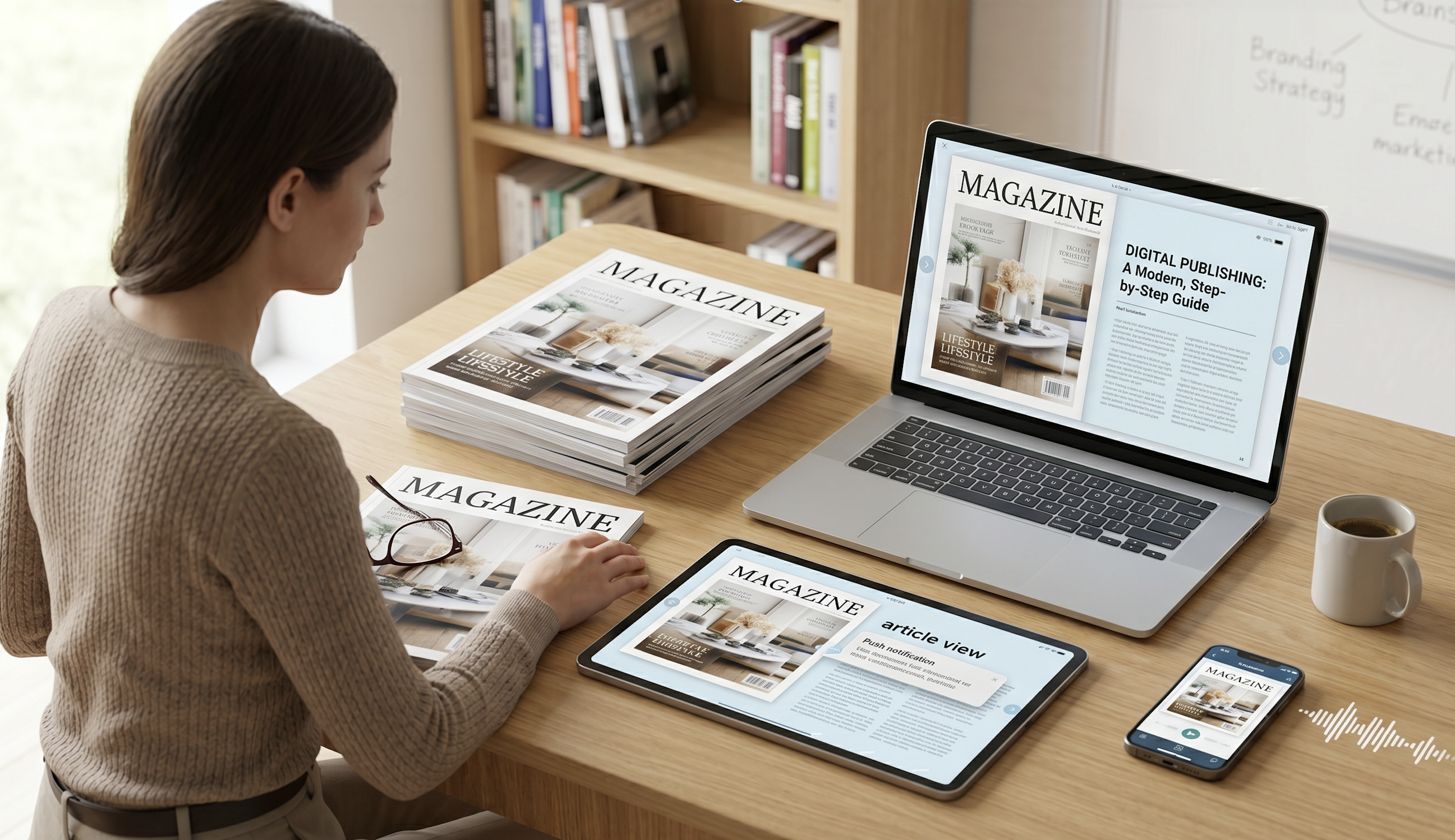
Transform your printed newspapers and magazines into digital formats that preserve the print experience while being fully accessible — with reading mode on iOS, Android, and the web. Learn more about digital editions
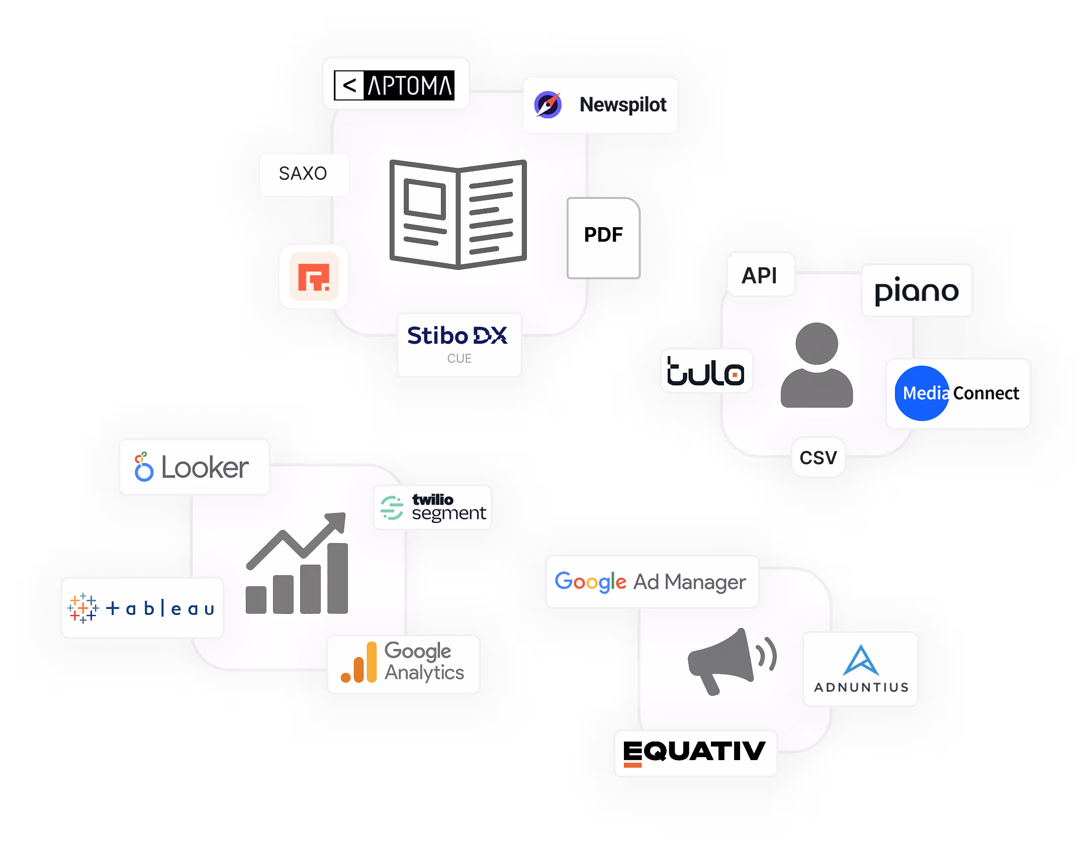
Easily integrate with your existing systems
Connect your authentication system, collect user data, and forward it to your analytics tools. Streamline publishing with automatic imports from your editorial platform — Prenly is built for seamless integration with your current tech stack. Learn more about integrationsYour own app. Full control over content and design
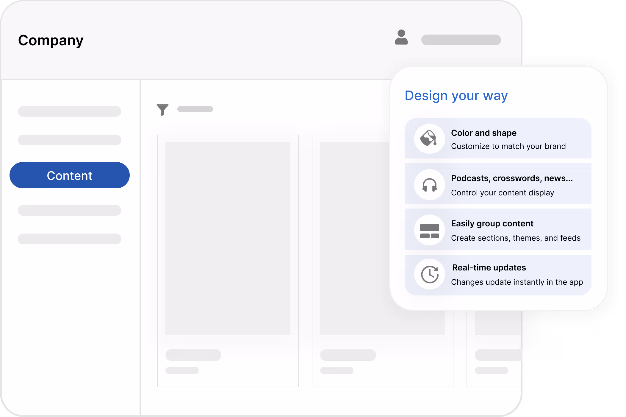
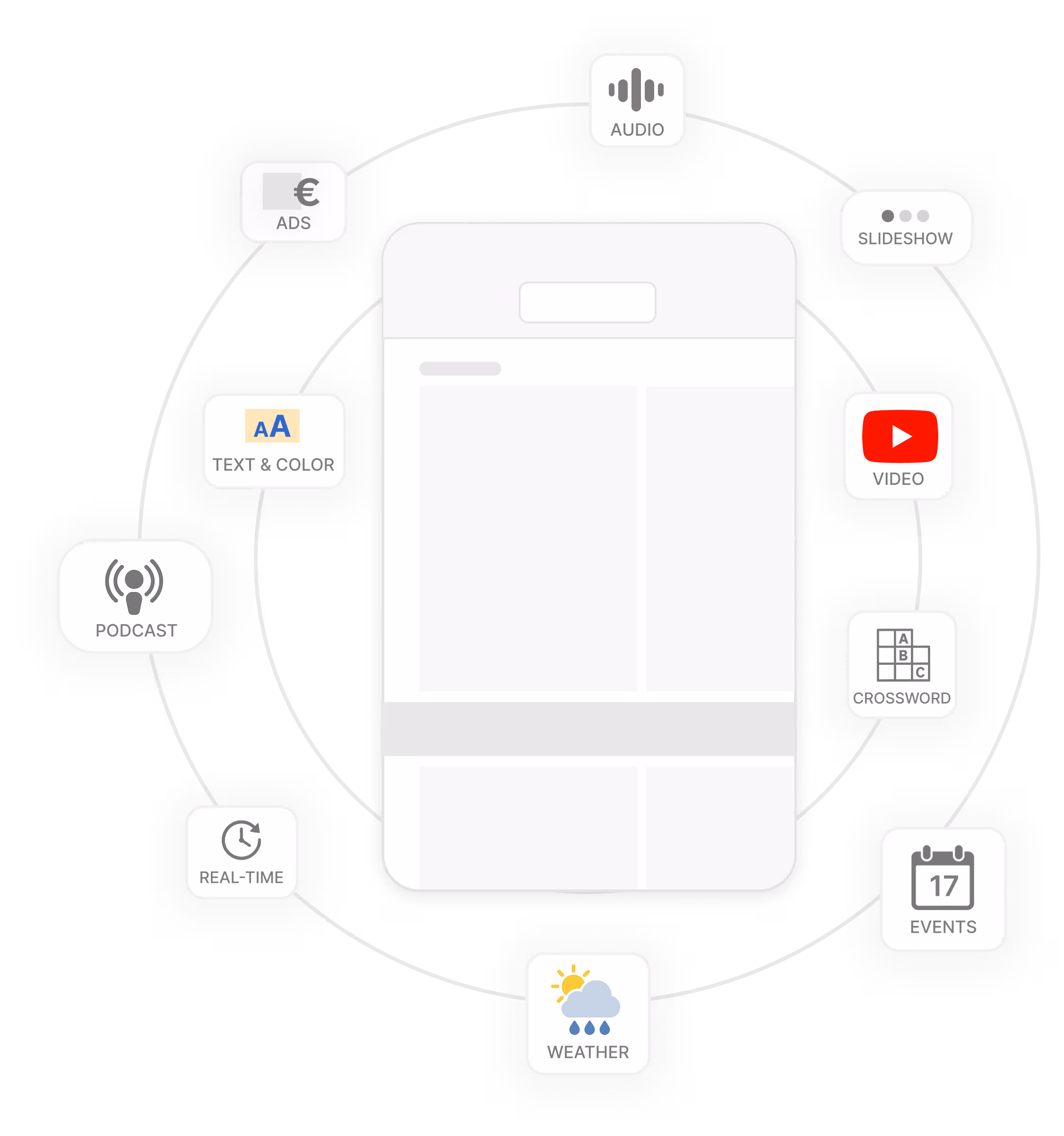
Prenly is the only app you need to distribute all your content – from newspapers and web news to podcasts, puzzles, and supplements. With smart analytics, easy integration, and full control over both content and design, you deliver a seamless experience from start to finish. Learn more about the Prenly app
 More than replicas. Exclusive digital content
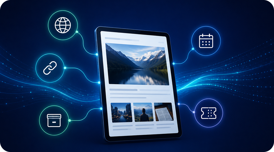
Enhance your printed replicas with exclusive digital features like additional images and videos, or create fully digital editions — all from one smart platform. Learn more about digital contentIncrease revenue with digital ads
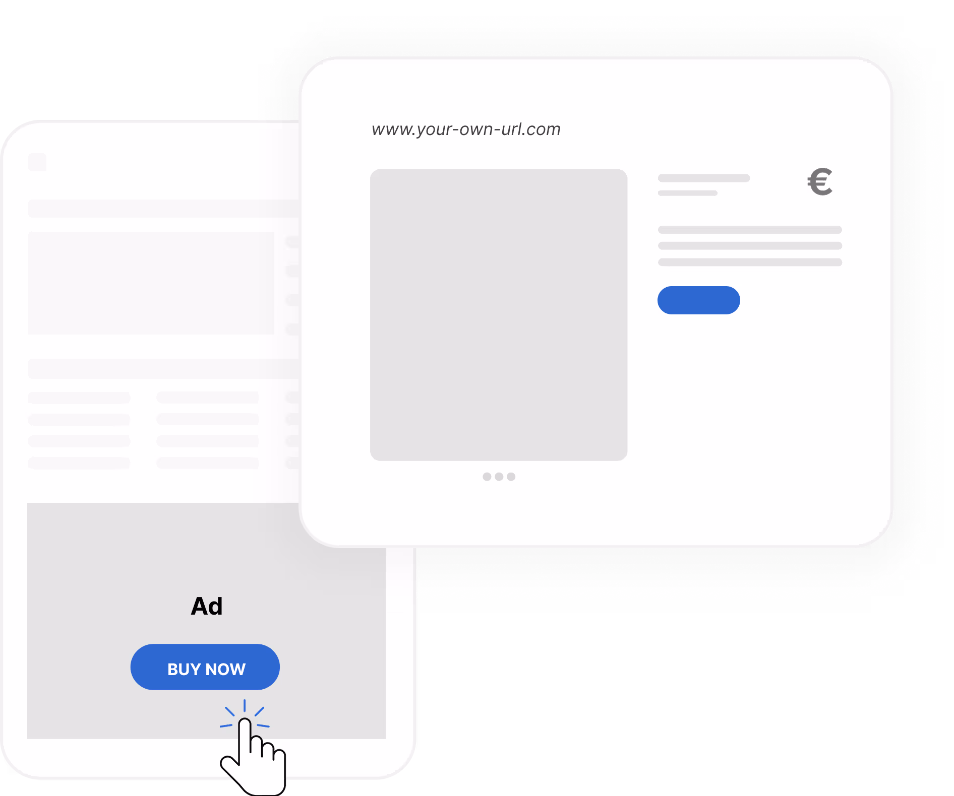
Boost your sales with full-page digital ads that don’t interfere with your print pagination. Add call-to-action buttons to increase ad visibility without disrupting the reading experience. Learn more about digital ads
 "We created the world’s first digital newspaper for the visually impaired back in 1979. Today, we run the fastest growing platform for digital publishing — with the mission to make content accessible to everyone"
Jens Halvarsson, CEO of Textalk Group

How to Publish a Magazine: A Step-by-Step Guide for Modern Publishers
Publishing a magazine today is not only about producing a printed issue. Modern publishers need to plan content, design a strong reading experience, distribute across print and digital channels, engage readers after publication, and understand what keeps audiences coming back.
Print can still be valuable, especially for loyal readers and premium formats. But digital reading is now central to how audiences consume media. Pew Research Center reports that 86% of U.S. adults get news at least sometimes from digital devices, while only 7% often get news from printed newspapers or magazines.
For magazine publishers, this means the publishing process needs to support both the edition experience and the modern digital journey. A magazine may now exist as print, e-paper, app content, web edition, article view, audio, newsletter links, and social sharing.
Prenly is an all-in-one digital publishing platform for newspapers, magazines, and media companies. It helps publishers create modern digital editions, improve reader experience, and manage digital publishing workflows across app, web, and e-paper formats.
5 ways to give access to content and attract more subscribers
Not every reader is ready to subscribe immediately. Try to strategically offer access to selected content to attract new audiences.
WAN-IFRA Congress 2026: AI, reader revenue and the future of publishing

WAN-IFRA Congress 2026, officially the 77th World News Media Congress, will take place June 1–3, 2026, at Palais du Pharo in Marseille, France.
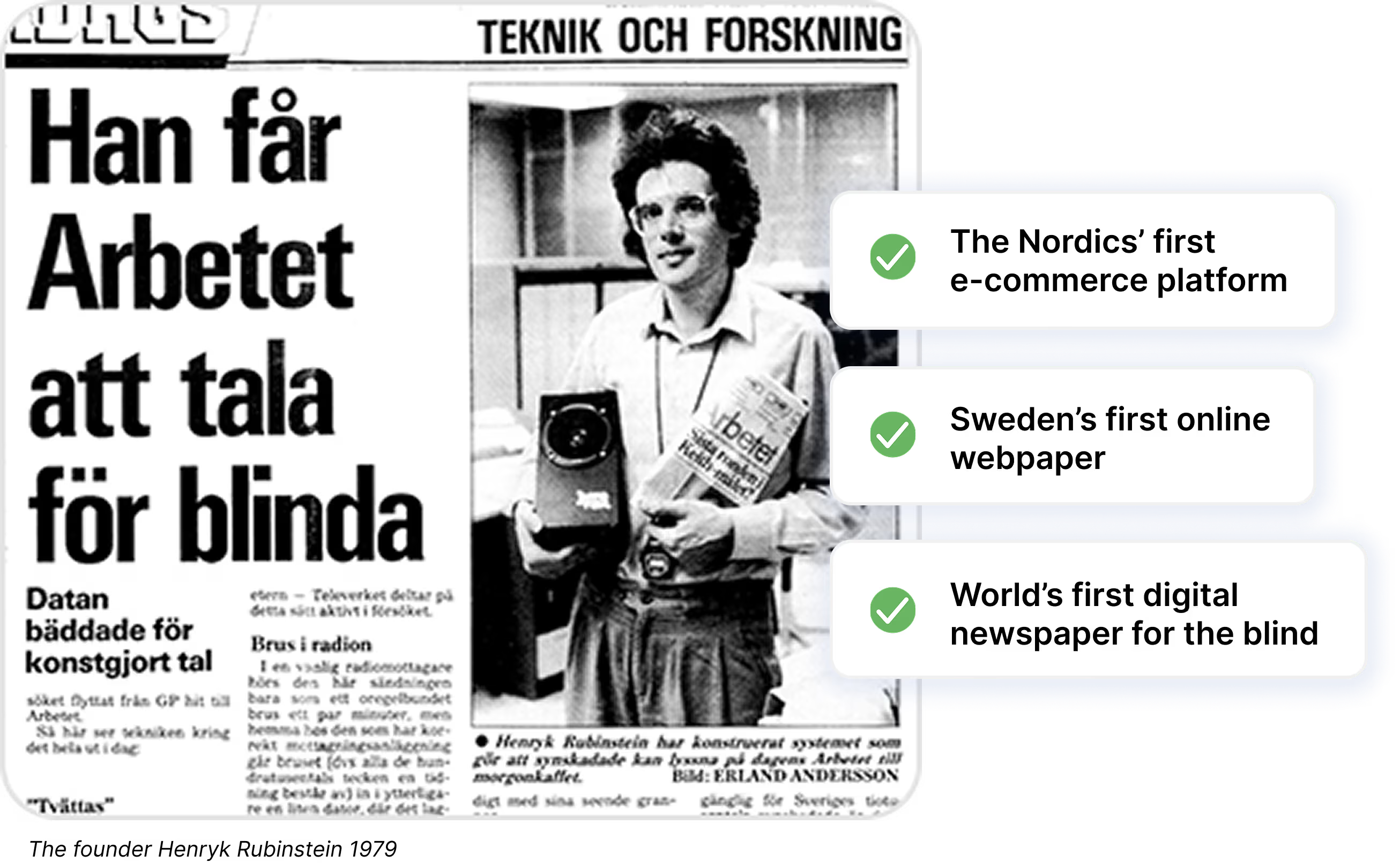 Pioneers since 1979
Prenly is powered by parent company Textalk, which in 1979 took the first step toward a more inclusive world by launching the world’s first digital newspaper for the visually impaired. Since then, we’ve continued to break barriers and create technology that empowers communities.
We believe in innovation that gives more people a voice, opens new paths for collaboration, and makes it easier to be part of something bigger. Learn more about TextalkBook a demo
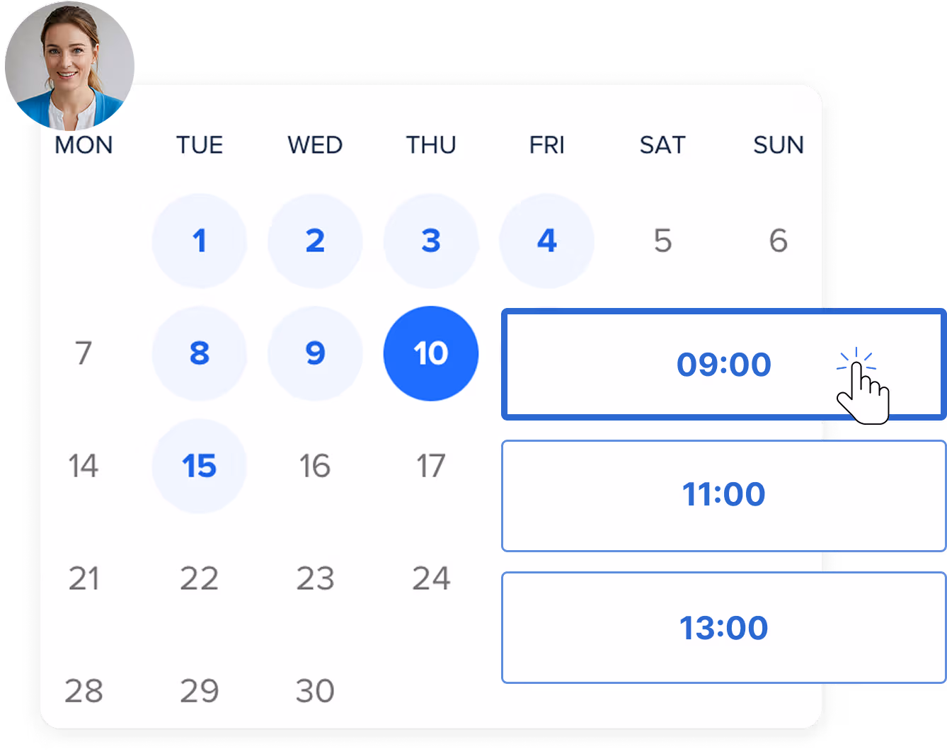
Choose a time that works best for you. We’ll walk you through the platform, show you how it simplifies your workflow, and answer any questions you might have. And of course, it’s completely free. Book your free demo